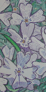
Unless you want to use white correction fluid-as they do in comic books-ink work is just not correctable. It is also not advisable for large works of art. An 8 x 10 section of paper, I think, is really too big to try a work and not expect there to be any mistakes or just simply, sloppiness. (Note: the drawing itself is more symmetrical than it looks in this photo. The camera was at a slight angle).
That is where this work has gone awry for me. This is one of my first attempts at using more than just a single color in pen and ink work. This was done using Faber Castell's Pitt artist pens.
If you try them I think you'd like them.
First I used a photograph I took as my model, first using transfer paper to trace a good deal of the image onto a white sheet of paper. I then sketched in additional details with pencil.
Once I had the image in place, I used my photograph as a reference as I inked in the colors in a decorative pen and ink style.
Here's what I'd do differently: first of all, I'd plan to do a much smaller work, just a few inches in length and width. Once I'd selected the parts of the photo I wanted to use, I'd create a model sketch in pencil just to try out different cross-hatching techniques, as well as the values of the composition. I'd also use less black. I was hoping that by adding black around the flowers I'd get them to "pop" more. I think that I could have accomplished that by using darker coloring, but avoiding black. The areas without flowers or greenery would still use black cross-hatching; maybe just one or two styles would be better.
Here's what I liked: though there were areas that needed work, I think this ends up being a good sampler for the kinds of techniques I'd like to use on future drawings. Let's zero in on some of the sections I liked.
1. This was a nice little bit of black crosshatching, with diagonals to the left and to the right, and with vertical strokes up through the center of them.

2. I like the black cross-hatching pattern around the bud below. It has some rounded strokes, as well as straight diagonals.
 3. The section below by itself would make a nice illustration. The only thing I might do differently is not using black to outline the flowers. However, it might be OK around the green. I'd have to test it out. I like how the blues and lavenders mix optically when placed side by side.
4. The section below also would make a good illustration by itself. I especially like the cross-hatching in the lower right green sections and the buds to be found there.

5. I really like the buds below. From the various colors used, to the decorative patterns throughout, this turned out nicely. I even like the way the black was used here. Reminds me of something one might find in a medieval illustrated book . . . .

6. I like the flowers in the grouping below, as well as the patterns that comprise this section. This could almost also make a nice illustration by itself by adding or subtracting a few parts of the selection here.

No comments:
Post a Comment